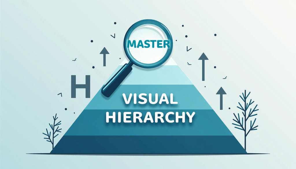
What Does Visual Hierarchy Mean?
Introduction
The concept of visual hierarchy is a key concept in design and can be defined as the arrangement and presentation of elements in a manner that indicates their significance. Simply put, it directs the eye of the viewer through a page, screen, or design in a certain sequence. A well-done visual hierarchy makes people automatically pay attention to the most significant information at the beginning and then proceed to the supporting information.
The concept is common in web design, graphic design, advertising, user interfaces, and even print media. Regardless of whether you are designing a web page, poster, or a social media post, knowing about visual hierarchy will enable you to convey your message in a more efficient way. In its absence, your design can be confusing, cluttered, or hard to comprehend.
Visual hierarchy is also significant in engaging users in SEO-oriented digital content. A properly designed layout enhances readability, time spent on a page, and bouncing rates, all of which matter in search engine ranking.
Understanding Visual Hierarchy in Design
Visual hierarchy refers to the way the design elements are arranged in terms of importance. It is used by designers to regulate what the audience looks at initially, secondly, and finally. This is done using a number of visual tools like size, color, contrast, alignment, spacing, and typography.
Considering a big bold headline, it is clear that people are attracted to it first before the body text. Likewise, a bright call-to-action button will be more noticeable than simple background elements. These variations help users to scan and comprehend information fast without having to read everything in detail.
Visual hierarchy is primarily aimed at enhancing clarity and usability. Users are more likely to remain engaged and take action when they can easily find what they are looking to do, be it reading an article, becoming a member of a service, or even purchasing a product.
Why Visual Hierarchy Is Important
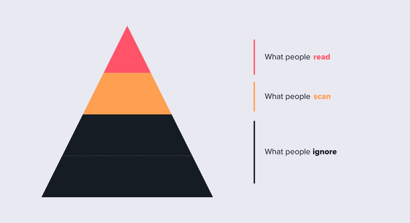
Visual hierarchy is significant as it directly influences the way people engage with content. In the modern digital era, users tend to skim through and not read all the words. Visual hierarchy is effective in directing their attention.
Enhanced user experience is one of the greatest advantages. With logical arrangement of information, users can easily navigate through the information without getting lost. This is particularly crucial in websites and mobile applications where attention spans are limited.
Another key benefit is better communication. The design should be well organized so that the most significant message is viewed first. This assists companies in emphasizing major offers, directions, or calls to action better.
SEO performance is also supported by visual hierarchy. The search engines prefer easy-to-read and user-friendly content. Good organization, subheadings, and legible formatting will help to increase the engagement metrics, which may enhance the rankings in the long run.
Key Elements of Visual Hierarchy
Designers have a number of fundamental components to build effective visual hierarchy.
All of them have a particular role in the direction of attention:
Size and Scale
Bigger things are more noticeable. To indicate importance, headlines are generally larger than body text.
Color and Contrast
Certain elements are emphasized by bright colors or high contrast between them. An illustration is that a red button on a white background is very conspicuous.
Typography
The various font weights, styles, and sizes are used to distinguish between headings and body content. Big fonts are usually used to show significance.
Spacing and Layout
White space (or negative space) helps to minimize clutter and enhance focus.
Alignment and Position
The first thing that is seen in a design is the elements that are at the top or at the center of the design. Structure and order are brought about by alignment.
When these components are combined, designers can successfully manage the experience of visual content by the users.
How to Use Visual Hierarchy Effectively
You must consider how your layout will be used by your audience to create a good visual hierarchy in design or web content. Begin by determining which message or action is the most important. This should be the most visually dominant element.
Then, arrange supporting information in layers. Divide content into parts with headings, and ensure that the body text is readable. Do not use excessive fonts and colors because they can make it less clear.
On web pages, it is imperative to place important items, such as headlines and call-to-action buttons, above the fold so that they are immediately noticed. Mobile design requires simplicity even more because of the small screen space.
It is also necessary to have consistency. The same styling rules applied to all pages enable users to learn about your design patterns quicker, enhancing usability.
Common Mistakes in Visual Hierarchy
Among the pitfalls is to make everything seem equally important. When everything is of equal size, color, or weight, users do not know where to pay attention. This causes confusion and decreases interest.
The other error is excessive use of bold fonts or bright colors. Although these tools are handy, excessive use can undermine the entire hierarchy. It is important to use them strategically.
Poor spacing is another issue. The layouts are crowded and thus make scanning of the content hard. Even the well-written information can be overwhelming without sufficient white space.
Lastly, inconsistent design decisions may disrupt the visual flow. When headings, buttons, and text styles are changed too frequently, users can become disoriented.
Why Visual Hierarchy Matters in Practice
Visual hierarchy is an influential design concept that assists in structuring information in a coherent and significant manner. Designers can direct the attention of the viewer and enhance comprehension by controlling size, color, spacing, and layout. It is an important aspect of web design, user experience, and SEO performance. Visual hierarchy simplifies content, and it makes it more interesting and efficient in conveying the message when used appropriately.