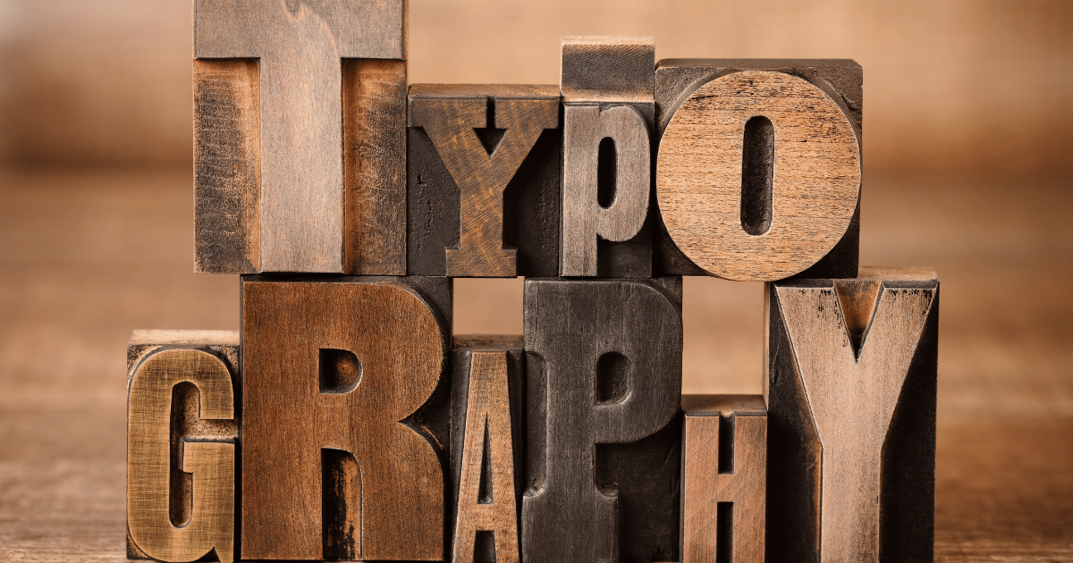
Why Is Typography Important in Web Design?
In the modern-day digital environment, web design is not only about attractive visuals or cool animations. It is about providing the best and efficient user experience- and typography is the key to that. When people access a site, they tend to have more interaction with the text than anything. That is why the selection of the appropriate typography is not only a question of beauty, but it is a major component of communication.
In this article, we discuss why typography is so essential to web design, and how it can affect everything including readability and brand identity.
First Impressions Matter
Typography Sets the Tone
When a person visits your site, one of the first things they see is the typography-even when they do not know it. The fonts, spacing and layout convey the tone and professionalism of your brand through silent communication.
For example:
- A law firm that used Comic Sans would immediately become unbelievable
- A creative agency that incorporates the use of sleek and modern fonts will appear more cutting-edge and innovative.
- Proper typography allows the visitor to know what type of business you are running, what your values are and whether they can trust you, without reading a word.
Improves Readability and User Experience
Make It Easy to Consume Information
Internet users are not reading everything. This is why the typography should help to skim and comprehend.
Key factors include:
- Font size: Must be big in order to read easily on any device.
- Line spacing (leading): Gives breathing room between lines.
- Line length: Ideal lines are around 50–75 characters long.
- Hierarchy: The use of headings, subheadings, bullet points and bold text can aid in the organization of content.
A legible and easy-to-read font will make people spend more time on your site, reduce the bounce rate and increase engagement.
Strengthens Brand Identity
Fonts Tell a Story
Typography is a crucial element of the visual identity of your brand. Your typefaces can also be used to show your personality and values just like your logo and colors.
Think about:
- Google- The font chosen is friendly and rounded and feels approachable and up to date.
- The New York Times –Uses a standard serif font that is associated with tradition and authority.
Typography is part of your brand recognition when used consistently throughout your marketing materials and your website. The visitors start to associate some fonts with your business so that you can stand out among other businesses.
Enhances Accessibility
Typography Affects All Users
Accessible web design isn’t just a trend—it’s a necessity. Typography is a very important part of making your site accessible to individuals with visual impairments, reading disorders or attention problems.
Best practices for accessible typography include:
- High color contrast between text and background.
- Use sans-serif fonts such as Arial or Helvetica to be clear.
- Avoiding all-uppercase text, which is harder to read.
The correct HTML tags of headings (H1, H2, H3), and screen readers.
When you pay attention to inclusive typography, you are not only operating within the laws, but also treating your users well.
Supports Responsive Design
Looks Great on All Devices
It is increasingly important to have responsive typography in the context of most traffic to websites being mobile.
That implies that your text must appear fantastic and be readable on:
- Smartphones
- Tablets
- Laptops
- Desktops
The current CSS features (such as relative units (em/rem) and media queries) enable designers to change font sizes and spacing depending on the screen size. Responsive typography would ensure that your well-designed site does not become a nightmare to the mobile users.
Increases Conversion Rates
Typography Can Guide User Behaviour
Proper typography does not only make your site look beautiful, but it can also shape the behaviour of your visitors.
Here’s how:
- Readable fonts and effective placements of the call to actions (CTAs) can help the user to navigate through the buyer journey.
- Typographic hierarchy (larger, bolder headings) helps focus on the important information.
- Goodly organized copy instills credibility, and users are more likely to sign up, buy, or call you.
In short, thoughtful typography can boost your bottom line.
Reduces Cognitive Load
Don’t Make Users Work Too Hard
Bad typography- crowded design, small font, variant style, causes the brain to strain to read. This is known as cognitive load.
When typography is clean and intuitive:
- Users find what they need faster.
- They retain information better.
- They’re more likely to return to your site.
Excellent typography removes any friction to the experience of absorbing your content.
SEO Benefits
Better Structure = Better Rankings
Typography and SEO do not appear to be directly related, but they are. The correct use of heading tags (H1, H2, etc.), easily readable fonts, and well-structured layouts assist both the users and search engines to understand the content.
Search engines reward sites that are:
- Easy to read
- Well-structured
- Accessible to all users
When typography helps to navigate and display the content structure, it helps to improve the SEO performance of your site.
Keeps Users Engaged
Typography Holds Attention
Users have short attention spans. When your text is difficult to read, unattractive to the eye, or when it overwhelms them, they will bail.
But when typography is done well, it:
- Invites users to keep reading
- Makes long articles feel shorter
- Encourages exploration of other pages
Effective typography can transform an inactive visitor to an active reader- and, potentially, a new customer- as well